Crathes Castle in Watercolour
Two Paintings, Two Different Views
Crathes Castle is a subject I have returned to twice, and looking at the two paintings side by side shows just how differently the same place can be interpreted in watercolour.
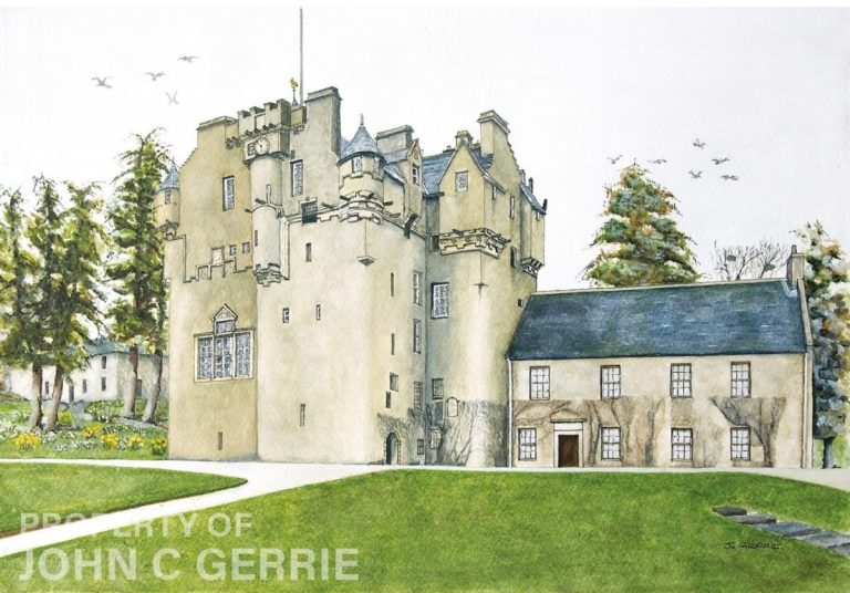
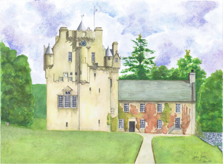
Both paintings feature the familiar tower house and the adjoining building, but the viewpoint, colour, atmosphere and composition are quite different. One is more detailed and architectural. The other is brighter, simpler and more direct.
Neither painting was intended to replace the other. Together, they show how my approach to the same subject can change.
The first Crathes Castle painting: detail and character
The first painting shows Crathes Castle from a slightly angled viewpoint. This allows more of the building to be seen and gives the castle greater depth.
The main tower dominates the composition, but the adjoining building, trees and sweeping path all play an important part. The curved path leads the eye naturally into the scene before turning towards the castle entrance.
I spent more time on the architectural detail in this version. The turrets, chimneys, windows, battlements and rooflines are all carefully defined with fine lines and restrained watercolour washes.
The result is a painting that feels quite precise without becoming too formal.
The colours are also relatively muted. Soft stone tones are balanced by dark slate roofs and natural greens. Much of the paper has been left light, particularly in the sky, allowing the detailed shape of the castle to stand out.
The birds add small touches of movement to what is otherwise a calm and settled scene.
The second painting: a brighter and more direct view
The second Crathes Castle watercolour takes a noticeably different approach.
Here, the castle is seen more directly from the front. The central path runs towards the entrance, creating a stronger and more immediate route into the painting.
The building feels flatter and more symmetrical than in the first version, but this gives the composition its own strength. The castle and adjoining building read almost as a single shape across the centre of the painting.
Colour plays a much larger part.
The greens are brighter, the sky contains soft blue and violet clouds, and the climbing plants on the adjoining building introduce warm red and orange tones. These colours give the painting a livelier and more decorative quality.
The painting is also less concerned with recording every architectural detail. Instead, it concentrates more on the overall impression of Crathes Castle and its setting.
The biggest difference: viewpoint
The choice of viewpoint changes almost everything.
In the first painting, the angled view gives the castle a stronger sense of depth. You can see different faces of the tower, overlapping rooflines and the relationship between the main castle and the adjoining building.
It feels as though you are walking around the grounds and have come upon the castle from one side.
The second painting is much more direct.
The central path takes you straight towards the building, while the frontal viewpoint makes the scene easy to understand at a glance. There is less visual complexity, but a stronger sense of arrival.
This is one of the things I find interesting about painting buildings. Moving only a short distance can completely change the character of the subject.
Two different approaches to colour
The first painting uses a restrained palette.
The pale stonework, deep slate roofs and darker trees give it a quiet, slightly traditional feel. The white sky also keeps attention firmly on the architecture.
In comparison, the second painting is much brighter.
The green lawn occupies a large area of the foreground, the sky is more active, and the coloured climbing plants bring warmth to the right-hand side of the building.
The difference is especially noticeable when the paintings are shown side by side. One depends more on drawing, tone and structure. The other relies more heavily on colour.
Which painting captures Crathes Castle best?
I do not think there is a simple answer.
The first painting gives a fuller impression of the architecture. It has more depth, finer detail and a stronger sense of the complexity that makes Crathes Castle such an interesting building to paint.
The second has a more immediate charm. Its brighter colours and straightforward composition make it easy to read and give it a cheerful quality.
For someone who enjoys architectural art and fine detail, the first painting may have greater appeal.
For someone drawn to brighter Scottish landscapes and more colourful paintings, the second may be the favourite.
That is perhaps the most interesting thing about comparing them. They show the same place, but they create quite different experiences.
Returning to the same subject
Painting the same subject more than once is not simply a matter of repeating an earlier picture.
A different viewpoint changes the composition. Different colours change the mood. Even the amount of detail included can alter the way we respond to a familiar place.
These two Crathes Castle paintings remind me that there is rarely only one way to paint a building.
The first version focuses more strongly on the castle’s architecture and three-dimensional form. The second offers a brighter and simpler interpretation, with more emphasis on colour and immediate visual appeal.
Together, they show two sides of one of Aberdeenshire’s most recognisable castles.
Which Crathes Castle painting do you prefer?
Do you prefer the detailed, angled view of the first painting, or the brighter and more direct composition of the second?
I would be interested to know which version catches your eye first.